A portable memory chest that helps people with Alzheimer's hold on to their memories
Nimo brings together photos, videos, and songs from a person's life, giving them space to revisit moments and share the stories behind them. Inspired by reminiscence therapy, it makes reconnecting with memories feel less like a therapy session and more like flipping through an old photo album.
This was a semester-long project developed with two fellow students during my Industrial Design Engineering degree at Costa Rica Institute of Technology (TEC), using the Design Thinking methodology.
Context
6th semester university project, Industrial Design Engineering at TEC
Team
Worked alongside Emmanuel Álvarez and María Belén Vargas
Timeline
18 weeks · August to November 2022
Deliverables
Functional and perceptual prototypes, technical drawings, product guide
01
Where it started
Alzheimer's is the most common kind of dementia, and it works slowly. First it takes the small things: where you left your keys, a name, what someone said an hour ago. Then it takes more. There's no cure, only therapies that slow it down.[1]
One of the best known is reminiscence therapy, and it's exactly what it sounds like: looking at, listening to and talking about meaningful moments from your own past, to hold on to who you are.[2]
Reminiscence improves cognitive ability, emotional wellbeing and the relationship with the person's caregiver.[2]
But many people never get regular professional sessions. Some aren't ready to ask for help, and some simply can't afford it.
Estimated people with Alzheimer's in the 2020s[4][5]
Disclaimer: ~62,500 is our own estimate, calculated using the data we found, since no official figure is available.[6]
We designed for the earliest stage of the disease, when people are still independent and aware enough to be scared.[7] But as the condition progresses, caregivers and healthcare professionals will become just as important to consider in the design process.
02
Meet Carmen
To bring our research to life, we created Carmen. She's 76, retired, married to Abel, and was diagnosed with Alzheimer's two years ago. She's fictional, but her experiences, fears, and needs are grounded in what we learned through our research.
Carmen Jiménez
OutgoingFamily-orientedSentimental
Age: 76Status: MarriedOccupation: Retired
About her
Carmen has a hard time accepting her diagnosis, and talking about it isn't easy. Abel, her husband, has noticed she struggles to remember recent events, yet she can recall moments from her youth in detail. Those memories bring her comfort and help her feel like herself again.
Frustrations
Not remembering names, activities, or even where she left something.
Struggling with simple everyday tasks.
Overstimulation: hearing many noises and seeing many things at once.
Feeling confused in different situations.
Fears
Intensity
Feeling alone, in a constant void
58%
Losing her memories, and her identity
90%
Forgetting the people she loves
72%
The uncertainty of the illness
46%
Needs
To preserve her memories from her youth
To keep remembering the people she loves
To feel emotionally well
Carmen was our main focus, but she wouldn't be using the product alone. Her family, caregivers, doctors, and therapists would all play a role along the way, so we needed to design with them in mind too.
03
Listening and looking around
Before sketching anything, we did our homework: we talked with the people who live this every day, and we studied everything that already exists.
01
A closer look at life with Alzheimer's
What we did
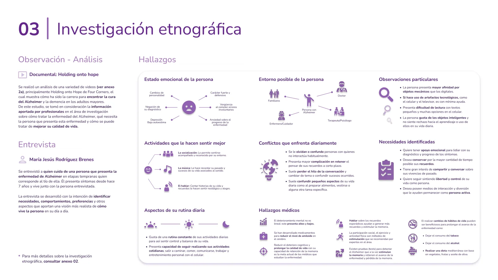
We interviewed María Jesús, who lives with and looks after her uncle with Alzheimer's. His symptoms started seven years ago. Additionally, we watched documentaries and expert talks on dementia research.[8]
What we heard
He avoids talking about his diagnosis, but lights up around people, music, and stories from his past. He also finds comfort in familiar routines and physical objects, while small text and too many choices can feel overwhelming.
Why it mattered
We realized the experience shouldn't feel like a reminder of his condition. It needed to build on what already brought him joy: familiar memories, music, and human connection, while keeping interactions simple and intuitive.
02
Nothing on the shelf was built to keep memories
What we did
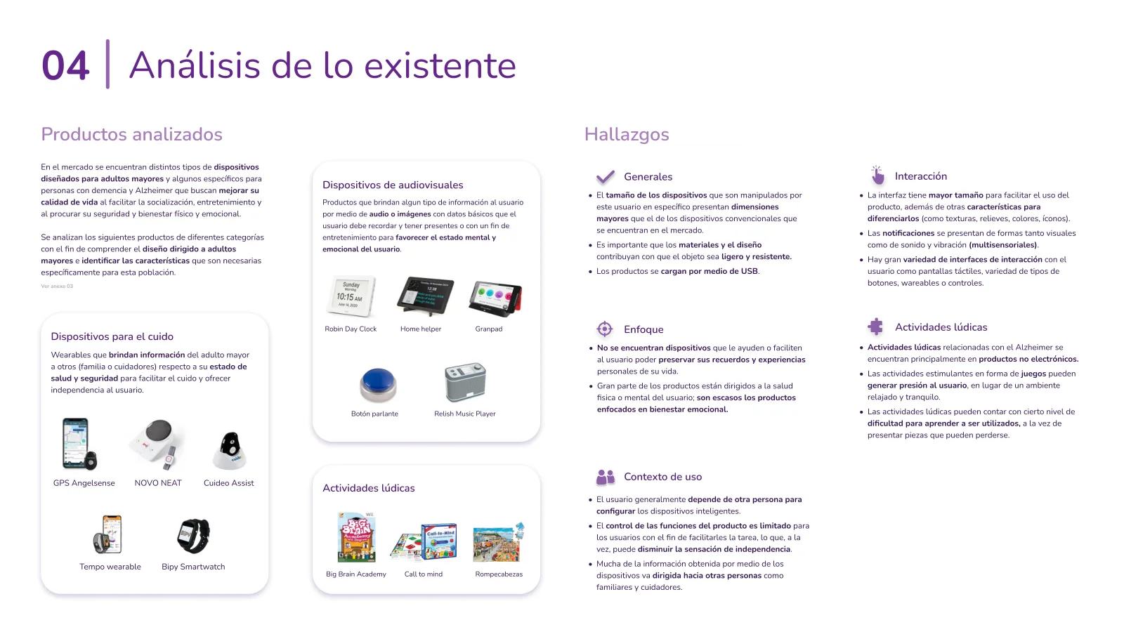
We analyzed 13 products for older adults and people with dementia, from GPS wearables and talking clocks to music players and memory games. We looked at their usability, features, and how they supported everyday life.[9]
What we found
Most products focused on health, safety, and helping caregivers. Many required help to set up, while others relied on small text, complicated controls, or frustrating games. Very few focused on preserving personal memories and experiences.
Why it mattered
We saw an opportunity to design something different. Not another safety device, but a simple, personal experience that puts memories, emotional wellbeing, and independence first.
2Define
Turning what we learned into a clear problem, and one idea to design around.
04
From insights to a clear problem
With all our research on the table, it was time to connect the dots. We needed to understand what was causing the problem, how it affected people's lives, and where design could make a difference.
01
Turning everything into one sentence
What we did
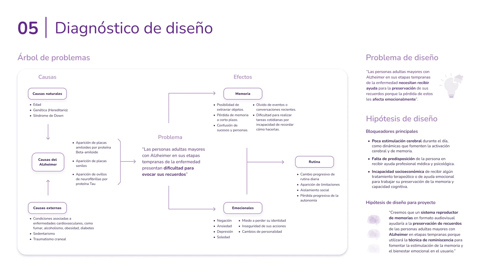
We built a problem tree to connect the causes of Alzheimer's with its effects on memory, daily routines, and emotional well-being. This helped us identify where design could make a difference.
The design problem
People in the early stages of Alzheimer's struggle to recall memories, affecting their emotional well-being and sense of identity.
Our hypothesis
What if an audiovisual memory player could help? By using reminiscence therapy, we believed it could stimulate memory and support emotional well-being.
02
Letting caregivers set the priorities
What we did
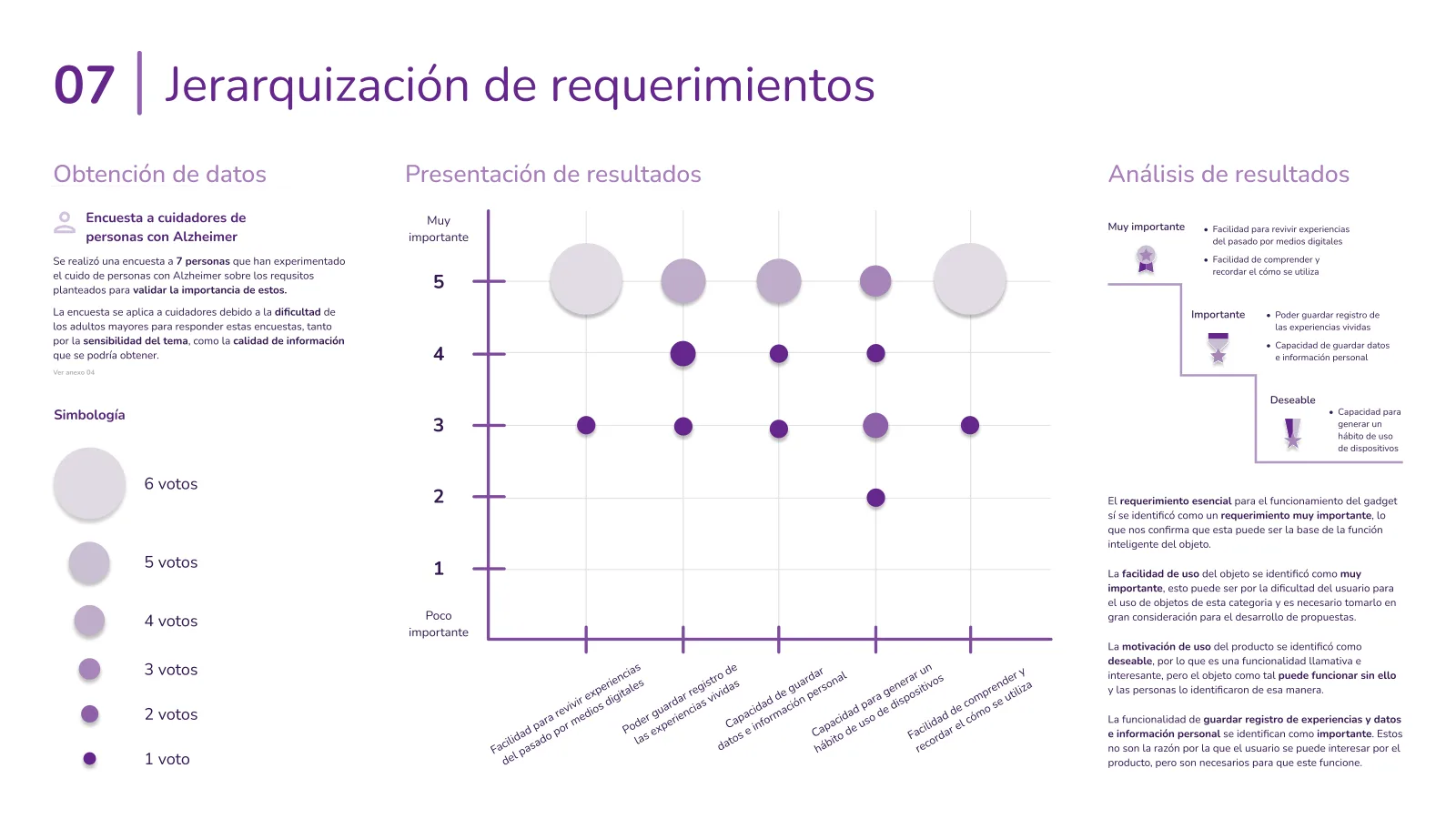
The topic is sensitive, so surveying people with Alzheimer's directly wasn't practical. Instead, we asked seven caregivers to rank our design requirements based on their experience caring for someone with the condition.
What we found
Revisiting memories and making the product easy to use came out on top. Saving personal information and experiences also mattered, while building a daily usage habit was less of a priority.
Why it mattered
This helped us focus on what mattered most: an intuitive experience that makes revisiting memories easy, without adding unnecessary steps or relying on daily use.
The design tension
Make revisiting memories feel comforting, not clinical, for someone who is already afraid of what the diagnosis says about them.
05
Deciding how to make it feel familiar
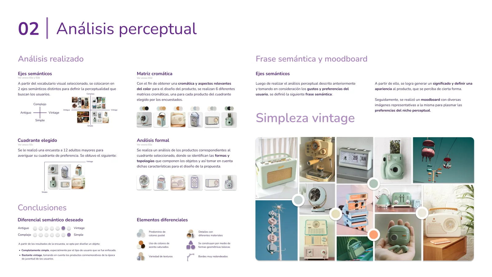
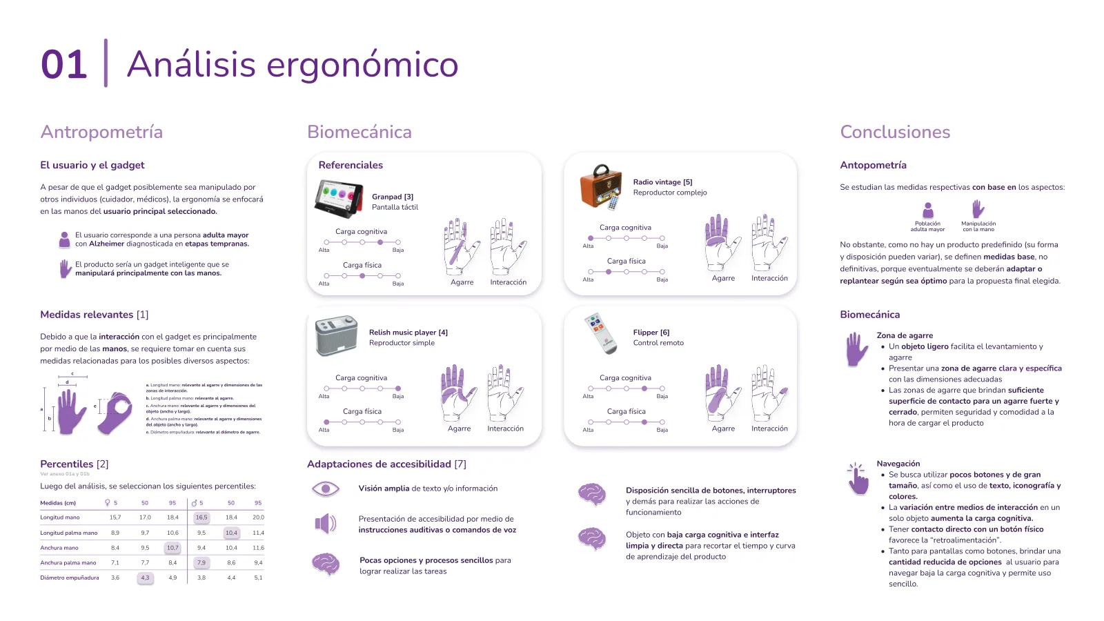
A device for older adults with Alzheimer's shouldn't feel like a medical device. So before choosing a shape, we focused on two things: how it looked and how it felt to use. We explored visual preferences with 12 older adults, then studied hand measurements, grip patterns, and everyday interactions to balance aesthetics with comfort and usability.
Key design decisions
Vintage simplicity: A familiar, nostalgic look inspired by objects from their youth.
Soft, friendly visuals: Pastel colors, geometric shapes, and rounded edges.
Familiar materials: A mix of plastic, chrome-like accents, and leather.
Comfortable handling: Proportions informed by older adults' hand measurements.[10]
Effortless interaction: Large controls, fewer choices, and simple, intuitive actions.
From a survey to a semantic phrase
We asked 12 older adults which visual style felt most familiar. Their preference for simple, vintage objects led us to our design direction: vintage simplicity.
Designing around older hands
We studied how existing devices are held and used, along with hand measurements from the 5th, 50th, and 95th percentiles, which helped guide proportions, grip, and controls.[10]
06
One idea to hold it all together
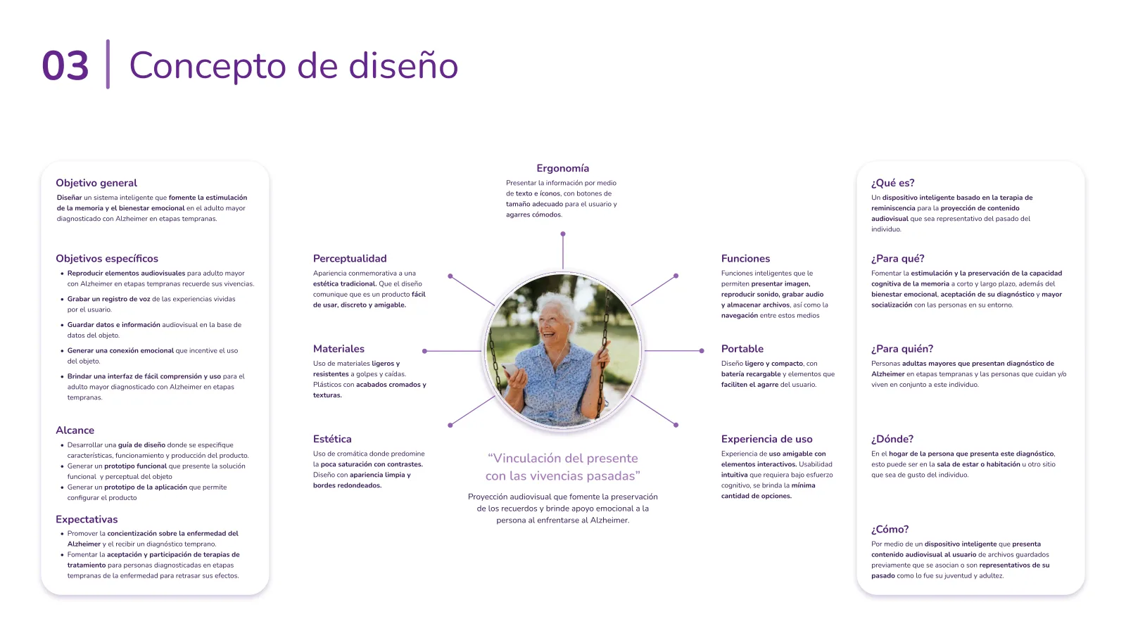
With the research done and the look decided, we needed a single idea to design around. We called it “Linking the present with past experiences.”
The picture in our heads was a memory chest. We imagined a familiar object that could bring personal memories into everyday life. Something that could play, preserve, and capture meaningful moments without feeling like a medical device.
Ergonomics
Comfortable grips, large controls, and clear text and icons designed around older adults' needs.
Perception
A commemorative look with a traditional aesthetic. The design should say it is easy to use and friendly.
Materials
Lightweight materials that resist knocks and falls. Plastics with chrome-like finishes and subtle textures.
Aesthetics
Soft colors with good contrasts. A clean look with simple shapes and rounded edges.
Functions
Play photos, videos, and music, record stories, store memories, and navigate between them.
Portable
Light and compact design with a rechargeable battery and elements that make it easy to grip.
User Experience
A friendly experience with interactive elements. Intuitive usability with fewer choices and minimal cognitive effort.
“Linking the present with past experiences”
Audiovisual projection that encourages the preservation of memories and gives emotional support to the person facing Alzheimer's.
General objective
Design a simple, personal device that uses reminiscence to stimulate memory and support emotional well-being in older adults with early-stage Alzheimer's.
The idea broken down
What
A device inspired by reminiscence therapy, designed to bring personal memories back to life.
For whom
Older adults with early-stage Alzheimer's, and the people who live with or care for them.
Where
At home, whether in the living room, bedroom, or wherever they feel most comfortable.
How
By playing familiar photos, videos, and music, and letting people record the stories behind them.
The five key objectives
These became the yardstick for every sketch we scored next.
1
Revisit memories: Play personal photos, videos, and music to encourage reminiscence.
2
Capture stories: Record voice notes about meaningful moments and experiences.
3
Keep everything close: Store memories directly on the device for easy access.
4
Build connection: Create an experience that feels personal, familiar, and enjoyable.
5
Keep it simple: Make every interaction easy to understand, navigate, and use.
See the full concept page
3Ideate
Sketching fifteen ideas, choosing one fairly, and meeting the product it became.
07
Fifteen sketches, one winner
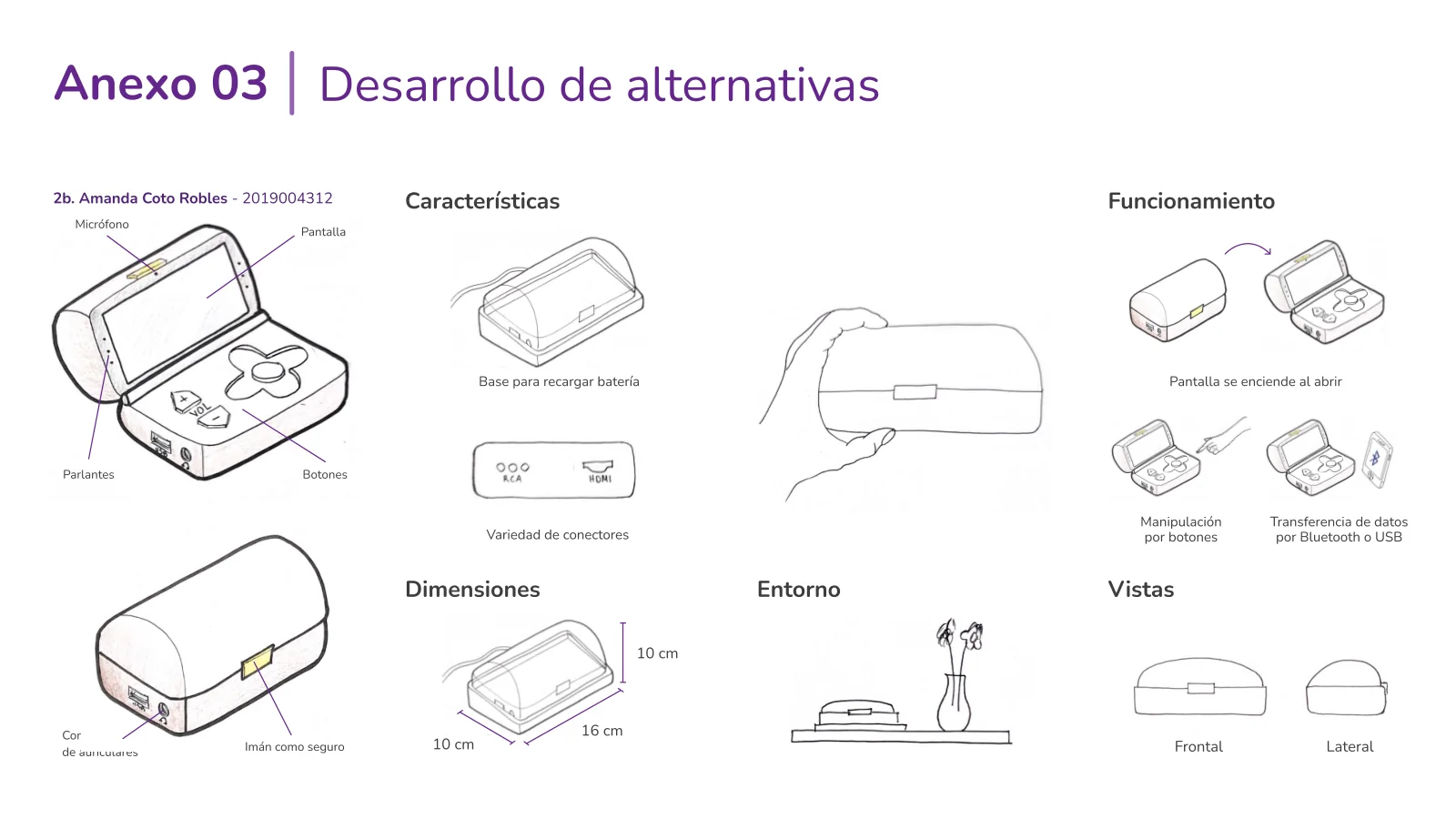
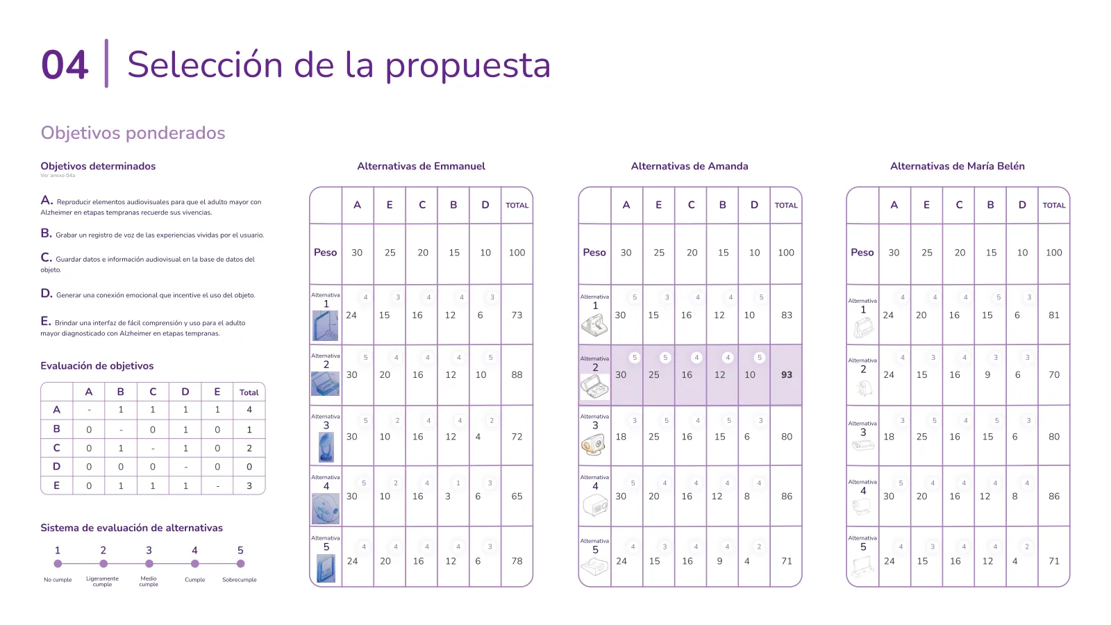
With our design goals in place, it was time to get sketching. Each of us came up with five concepts, giving us 15 ideas to choose from. To pick fairly, we first ranked the five objectives from the concept against each other, which gave us weights instead of gut feelings. Then every sketch got a score from 1 to 5 against them.
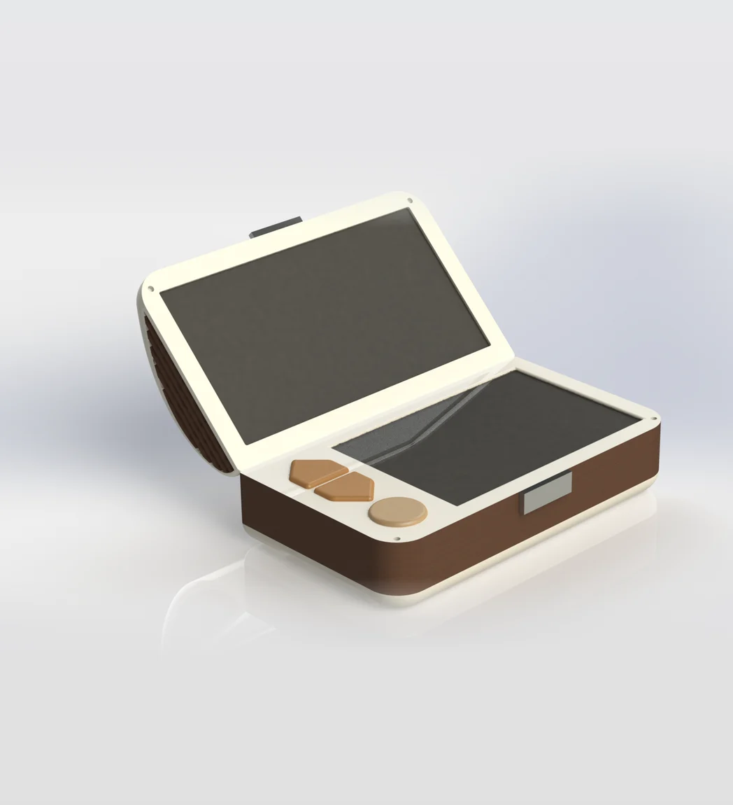
The top score, 93 out of 100, went to a sketch from my set: a box that opens like a chest, with the screen in the lid, a magnetic latch, a headphone jack, and a base that charges it. The team took it from there and built it into the final proposal.
The winning concept
The idea was simple: open the chest, and the screen turns on. No complicated setup, no menus to navigate just to get started. A familiar gesture made the experience feel more natural and intuitive.
The decision matrix
Weighted objectives, one table per team member. The highlighted row is the winner.
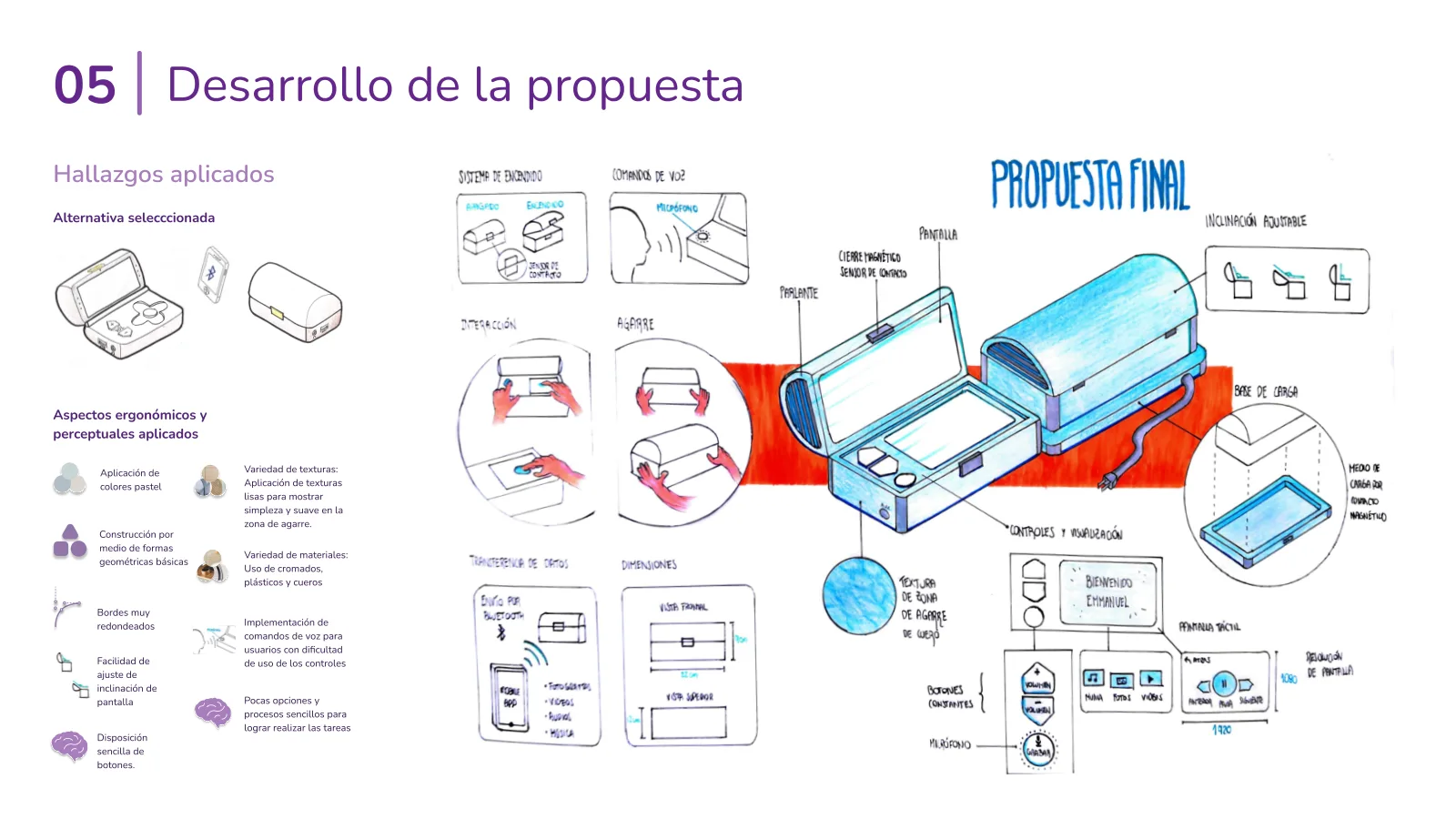
Developing the proposal
Where the winner met everything we'd learned: voice commands, an adjustable screen tilt, a grippy texture on the sides, and a charging base that connects by magnetic contacts.
08
Meet Nimo
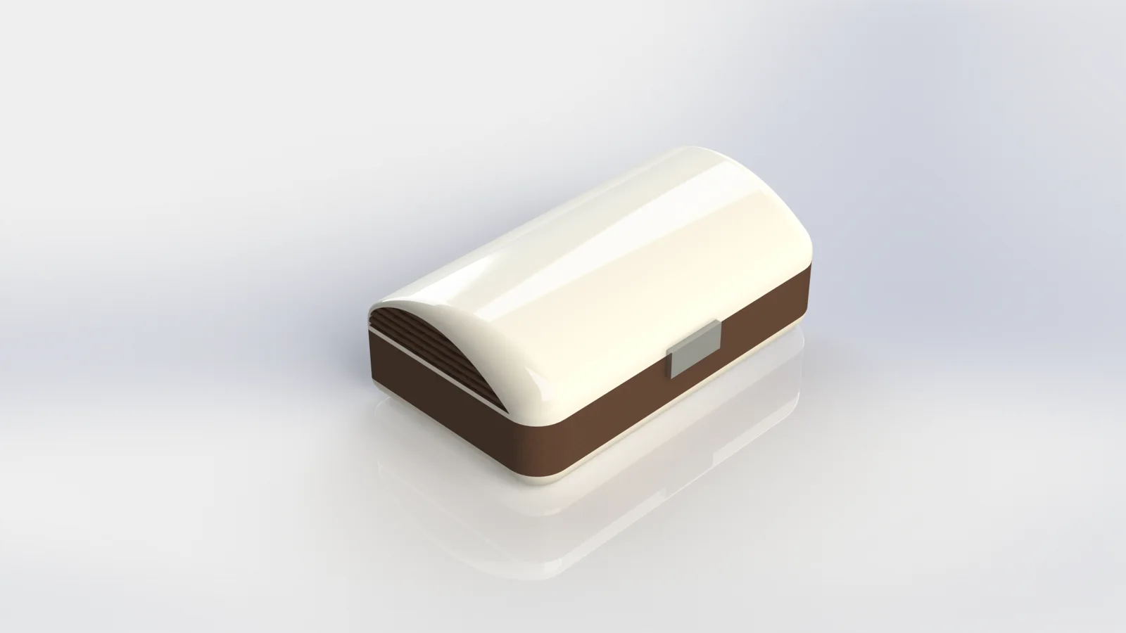
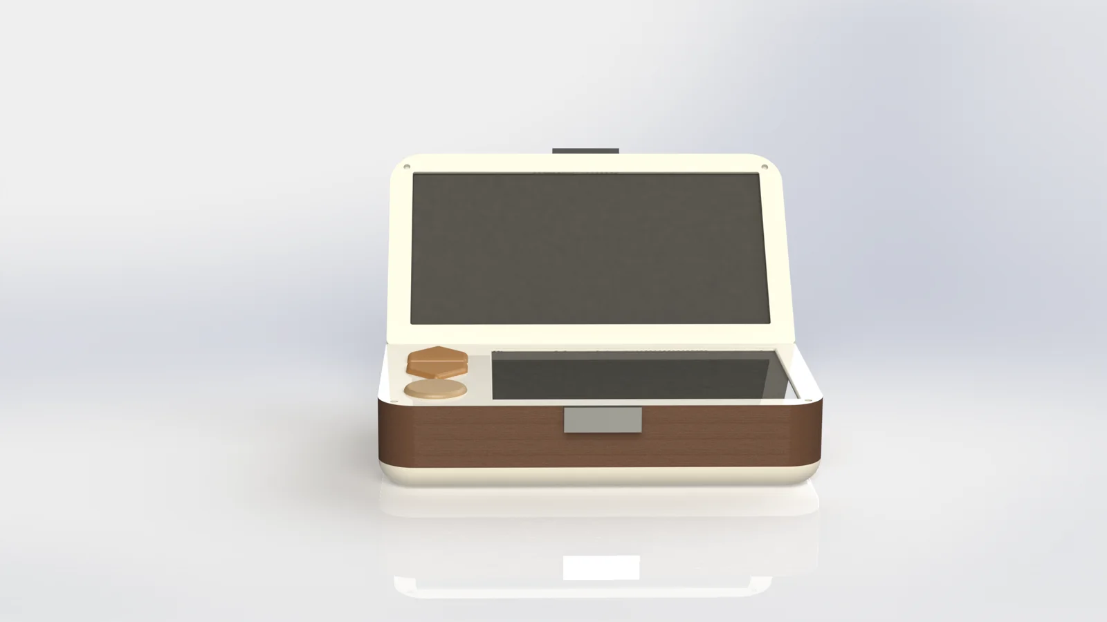
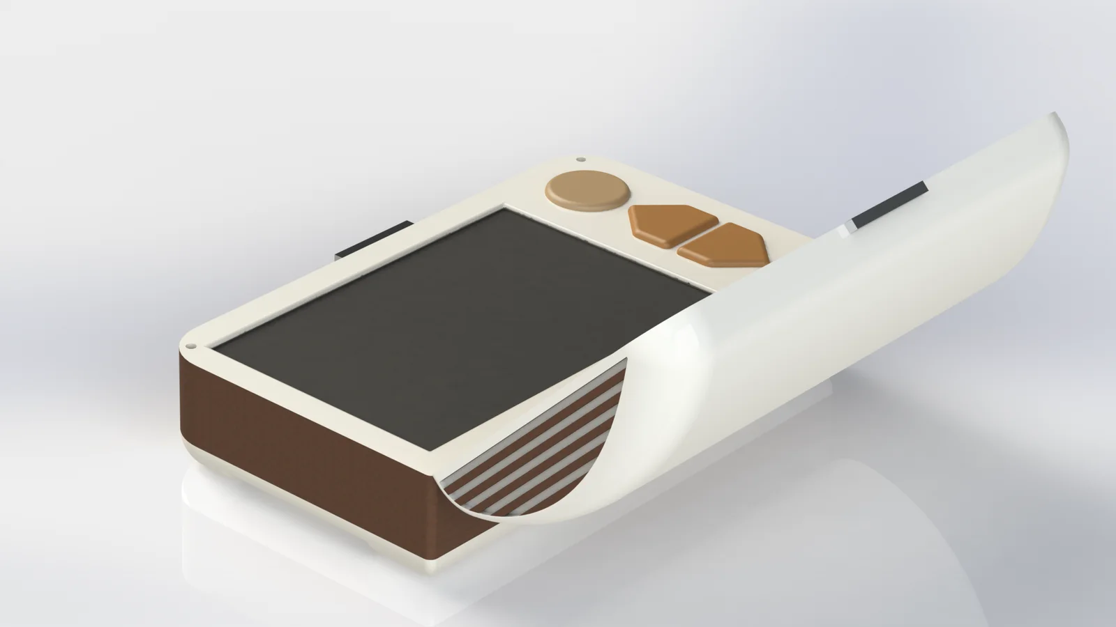
Nimo is a small chest that holds a person's memories. Open the lid and it wakes up: a screen on top, a touchscreen below, and big physical buttons for volume and recording.
A keepsake box that happens to play your life back to you.
Plays photos, videos and music, loaded from a phone over Bluetooth
Shuffles content it knows the person loves, or lets them choose exactly what to see
Records voice notes, so the story stays attached to the photo
Easy to start
Open the lid and it turns on, close it and it turns off, thanks to a contact sensor
Nothing to find, nothing to press first
Two ways to watch
Shuffle: content picked from what the person prefers
Select: choose one specific photo, video or song
Stories attached
Hold the record button and talk to save a memory
Voice notes are linked to the content on screen
Comfortable to hold
Recesses on both sides of the base for a secure grip
A synthetic leather wrap that feels good and doesn't slip
Sized from hand measurements: 175 × 100 × 63.3 mm
Simple to read
Few options, big buttons, icons plus text
Volume and record stay as physical buttons, always in the same place
A headphone jack for clearer, more direct sound
Easy to fill and charge
A phone app sends content over Bluetooth
A charging base with contact points, no cables to plug in
Use it on a table, in your hands or in your lap
Take the tour
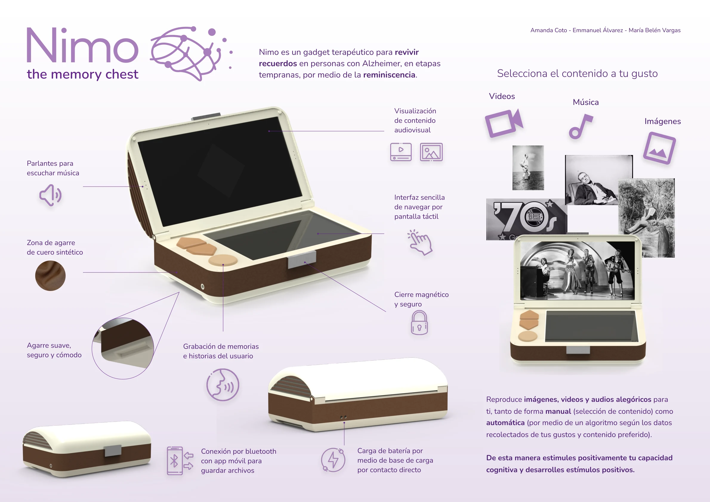
Nimo, in one page. This is the poster we made to present it, and it works as a quick tour: the lid screen, the soft leather grip, the magnetic closure, voice recording, Bluetooth transfer and the charging base, plus the kind of memories it plays back. The poster is in Spanish, just like the pitch.
How it's used
Watch the pitch (narrated in Spanish, so turn the captions on), or follow the six steps. Almost none of them involve thinking.
1
Open
Lift the lid and Nimo turns itself on.
2
Choose
Pick videos, images or music.
3
Pick a mode
Shuffle, or select a specific file.
4
Browse
Previous, play or pause, next.
5
Add a story
Adjust the volume, or hold record and tell the story behind what's on screen.
6
Close
Shut the lid and Nimo goes to sleep.
4Prototype
Giving the idea a body: how it works, how it looks, how it feels.
09
Building it twice
One prototype can't prove everything, so we built two: one to test how it works, and one to test how it looks and feels. Together they cost around ₡128,000 (about $200), which is the whole point of prototyping early.
Prototype 1 · Functional
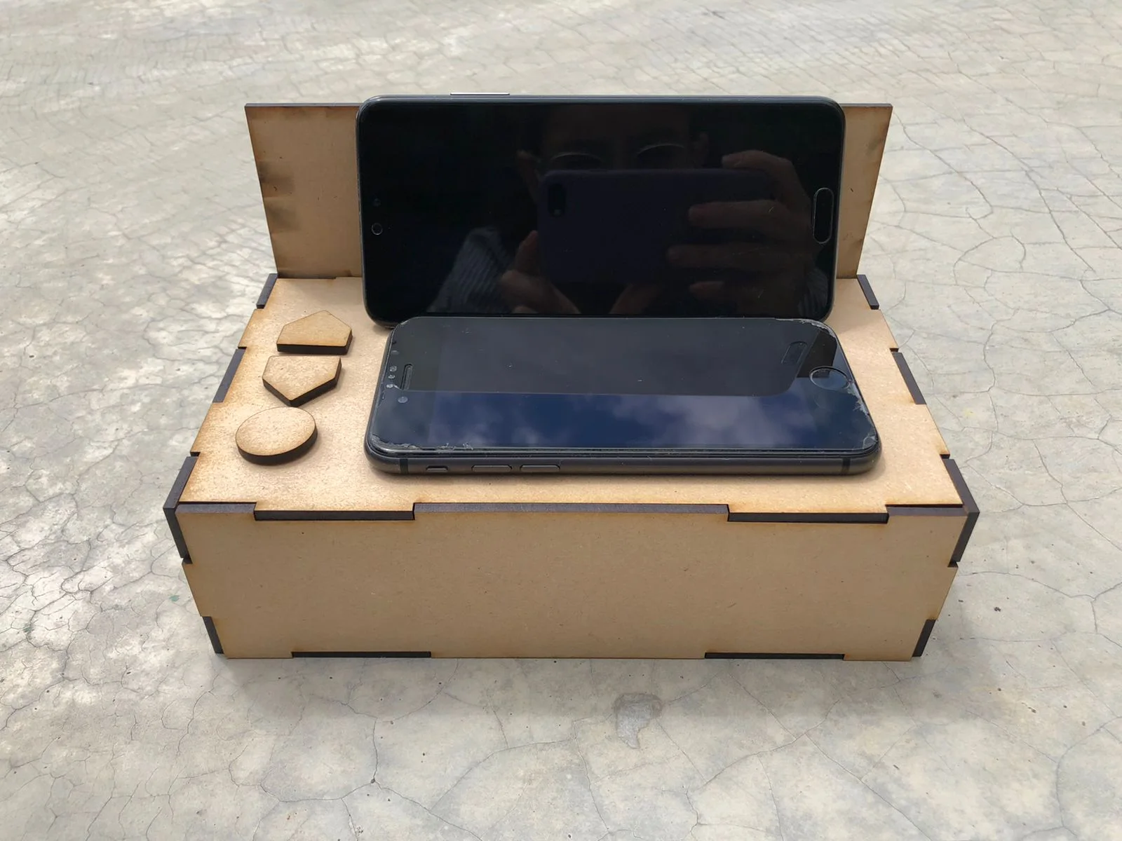
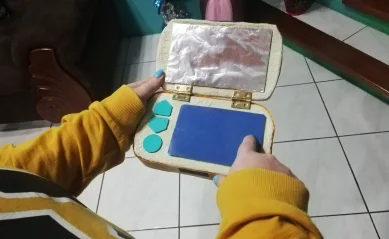
A plain wooden box that proved the interaction
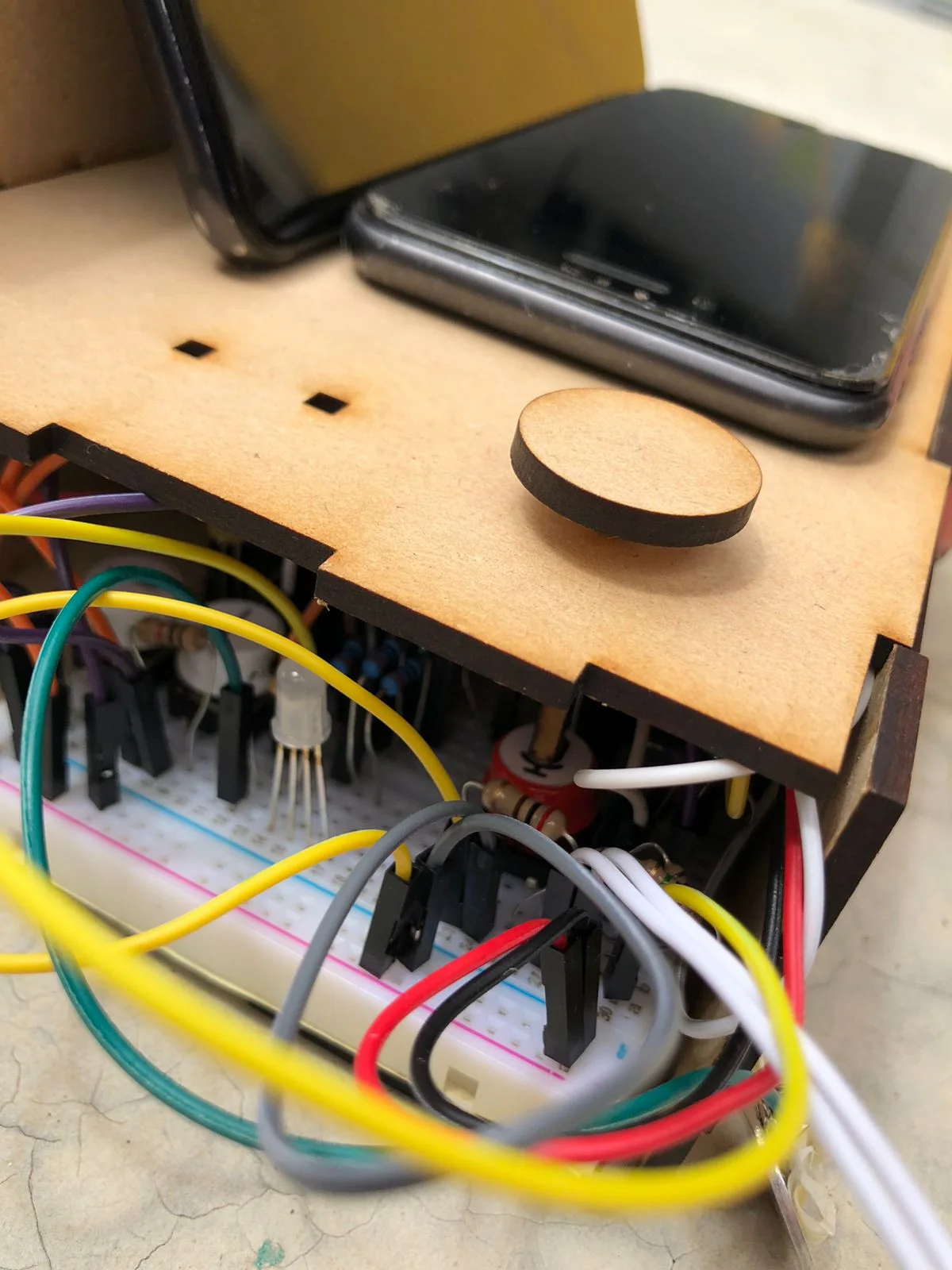
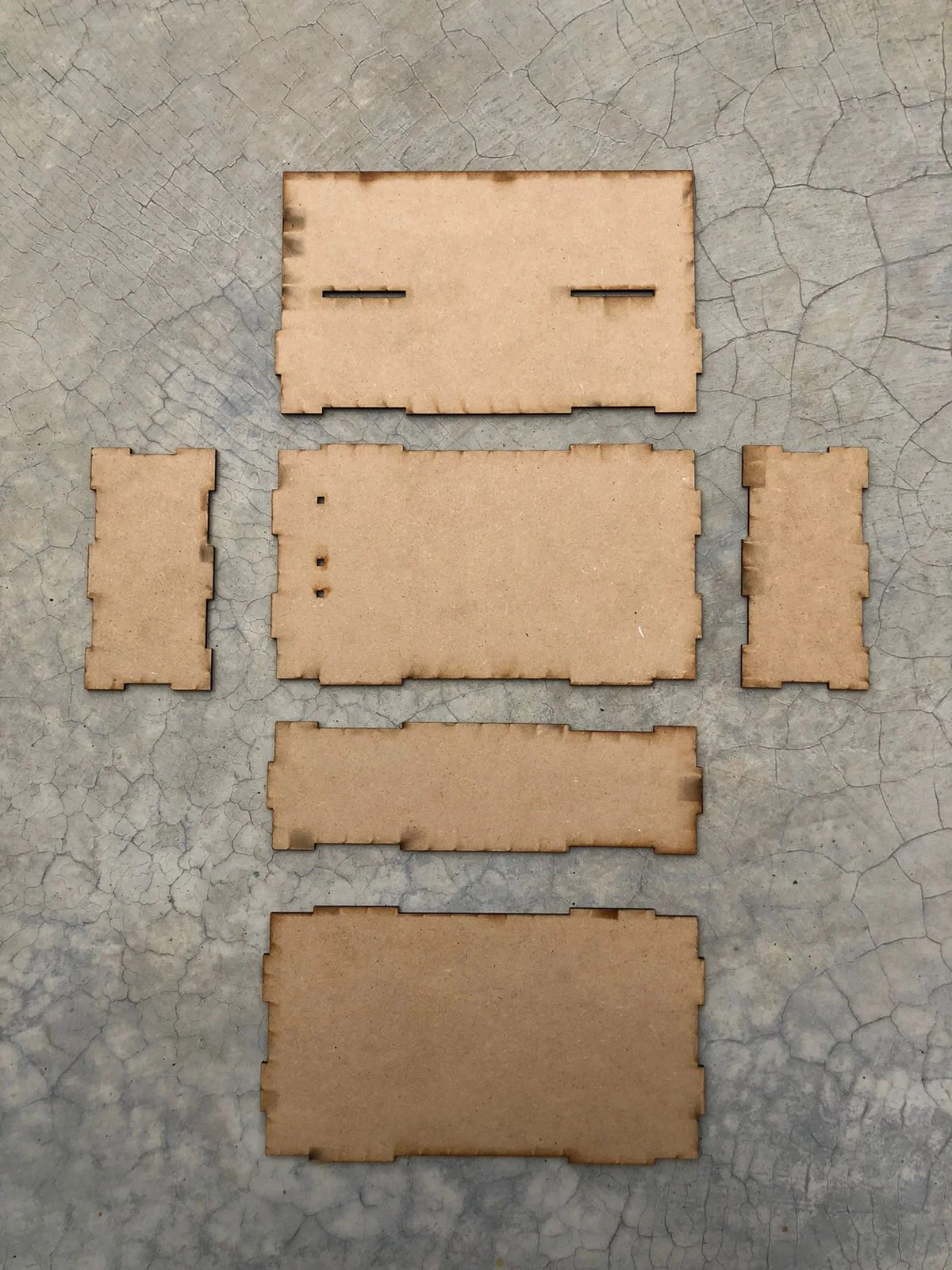
The not-so-pretty inside.Laser-cut pieces, before gluing.
What it had to prove
That the flow made sense in real hands: open the lid, pick content, browse, change the volume, record.
How we built it
A 3 mm MDF shell, laser cut at the TEC with interlocking joints and white glue. Two smartphones played the lid screen and the touchscreen. An Arduino, a breadboard, LEDs, buttons and a voice module did the rest.
Why it mattered
It let us run the usability test before spending a single colón on the final look.
Prototype 2 · Perceptual
A second model, just for looks and feel
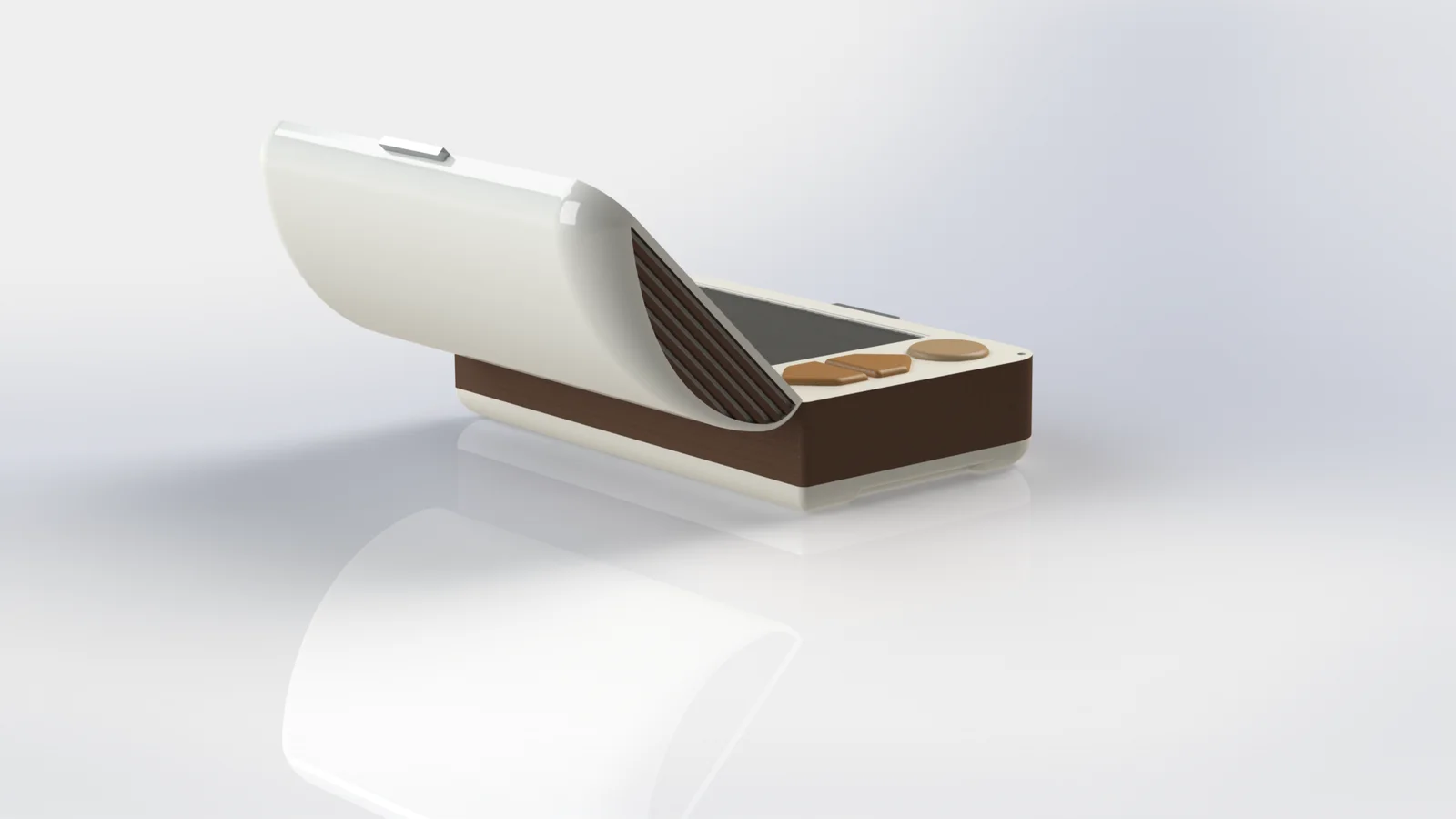
Our first model, early October.The final design, from the back.
What it had to prove
That the shape, color and materials said "friendly keepsake" and not "medical gadget".
How we built it
Modeled in SolidWorks and 3D printed in PLA, then sanded, primed and spray painted. Our first model was bright and playful; the final one settled on cream and brown, like an old keepsake box.
Why it mattered
Separating "how it works" from "how it feels" meant neither test had to compromise.
5Test
Putting it in real hands, and being honest about what we found.
10
Testing with real hands
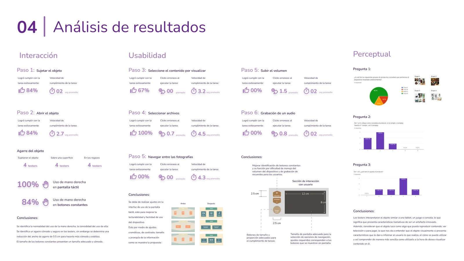
We tested the functional prototype with six people between 65 and 85, living with things like Parkinson's, dementia and arthritis in the wrists. They went through the whole flow, from picking up the box to recording a voice note, while we timed each step and watched where they hesitated.
An important caveat: none of them had a diagnosed early-stage Alzheimer's. We couldn't arrange that within the project, so these findings tell us about usability, not about how Nimo works for the person it's designed for.
01
The grip worked, with one small trim
What we saw
84% held and opened it successfully. Testers moved naturally between holding it, resting it on a table and setting it in their lap, and used their right hand on the touchscreen every time. Socorro picked it up sideways and opened it like a book, which says a lot about the mental models people bring.
What changed
We narrowed the grip by 0.5 cm, to be more comfortable and cleaner to look at.
Why it mattered
The always-visible buttons were already a comfortable size, so the physical shape was in good shape.
02
The touchscreen needed contrast, not more features
What we saw
Choosing a content type was where people stumbled: 67% got it right the first time. Picking a specific file, though, went smoothly for everyone.
What changed
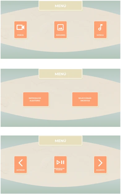
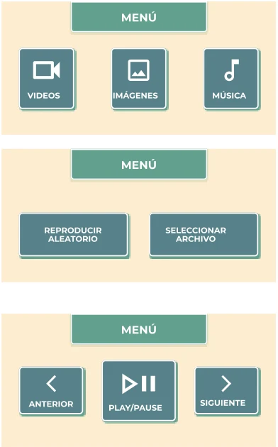
We redrew the menus with stronger contrast, larger targets, clearer labels and a stricter visual hierarchy.
Why it mattered
Same three screens, but easier to read at a glance, which is exactly what you want when reading is already hard.
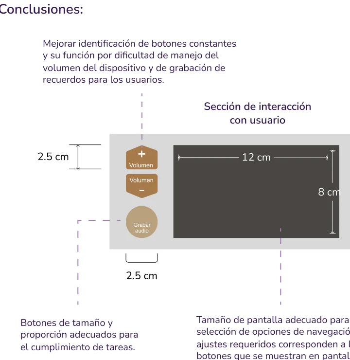
Volume and record were harder to identify than anything else on the device.
What changed
We resized the buttons to 2.5 cm, clarified their labels, and grouped them in one interaction zone next to a 12 × 8 cm screen.
Why it mattered
These buttons carry the most emotional weight: the volume of a favorite song, the recording of a story. They can't be a guessing game.
04
People read it as a device that plays things
What we saw
In the perceptual survey, people described Nimo as something like a tablet, a game or a console, and said it looked like it would play content.
What it means
The object itself helps explain what it does and how to use it, which is half the job.
What I'd test next
Whether the "memory chest" idea lands on its own, without us there to tell the story.
See the full results slide
11
Results and what I'd carry forward
Nimo is a course project, so there are no sales or retention numbers here, and no clinical outcomes either. What I can share is how it held up in front of people, and how it compared with everything else we looked at.
6
Testers, ages 65 to 85
Living with Parkinson's, dementia or wrist arthritis. They helped shape the grip, the screen and the buttons.
84%
Held and opened it successfully
Everyone found a comfortable way to hold it, which led to just a 0.5 cm trim.
13
Products analyzed, none built to keep memories
Which is exactly the gap Nimo was designed to fill.
93/100
Top score out of 15 concepts
A chest with a screen in the lid beat the other 14 on our weighted objectives.
Key takeaway
Overall conclusion
The core idea held up: a box that opens like a keepsake, plays what you love and keeps your stories, in a package older hands could hold and read.
The next step is the one we couldn't take: putting it in front of people in the early stage of Alzheimer's.
What I'd carry forward
What I learned: when you design for a condition that keeps changing, simplicity stops being a style and becomes a requirement. And when the people you're designing for can't answer your survey, you find the next-best voices, and you stay honest about what those voices can and can't tell you.
What I'd do differently: find a way, with the right ethical support, to test with people in the early stage of Alzheimer's. I'd also test the screen design earlier, since that's where most of our changes came from.
What I'd try next: design and test the companion phone app. Caregivers will probably be the ones loading the memories, so their experience matters just as much as Carmen's.
Beyond the device
More than a gadget, a way to start the conversation
We hoped Nimo could do something bigger than play photos. By making remembering feel warm instead of clinical, it could nudge families to talk about a diagnosis earlier, and make therapy feel like a natural next step instead of a scary one.
Its whole promise fits in one line: even as the illness moves forward, a person's identity stays safe inside their memory chest.
No, it was a university project for my Industrial Design Engineering degree at the TEC, done as a team of three. We shared the work across research, ideation, prototyping and testing, so I'd rather describe it as a team effort than split it into roles.
No. We tested with six adults aged 65 to 85 who live with other conditions, like Parkinson's, dementia and wrist arthritis. That tells us a lot about grip, reading and button use, but not about how Nimo works for its intended user. For the research side, we leaned on a caregiver interview and a survey of seven caregivers.
Because of what we heard. The person we learned about preferred mechanical objects over digital ones, struggled with small text and too many options, and loved music, company and telling stories. A physical object with a lid, a few big buttons and a familiar, vintage shape fit that better than a phone screen.
The highest-scoring concept, at 93 out of 100, came from my set of five sketches. But Nimo as it is today is a team design: the voice commands, the adjustable tilt, the perceptual direction and the prototypes all came out of working on it together.
Test with people in the early stage of Alzheimer's, with proper ethical guidance, and test the touchscreen interface earlier. Most of our changes came from the screen and the physical buttons, so that's where early feedback would have saved the most time.