UX/UI Design · 2025
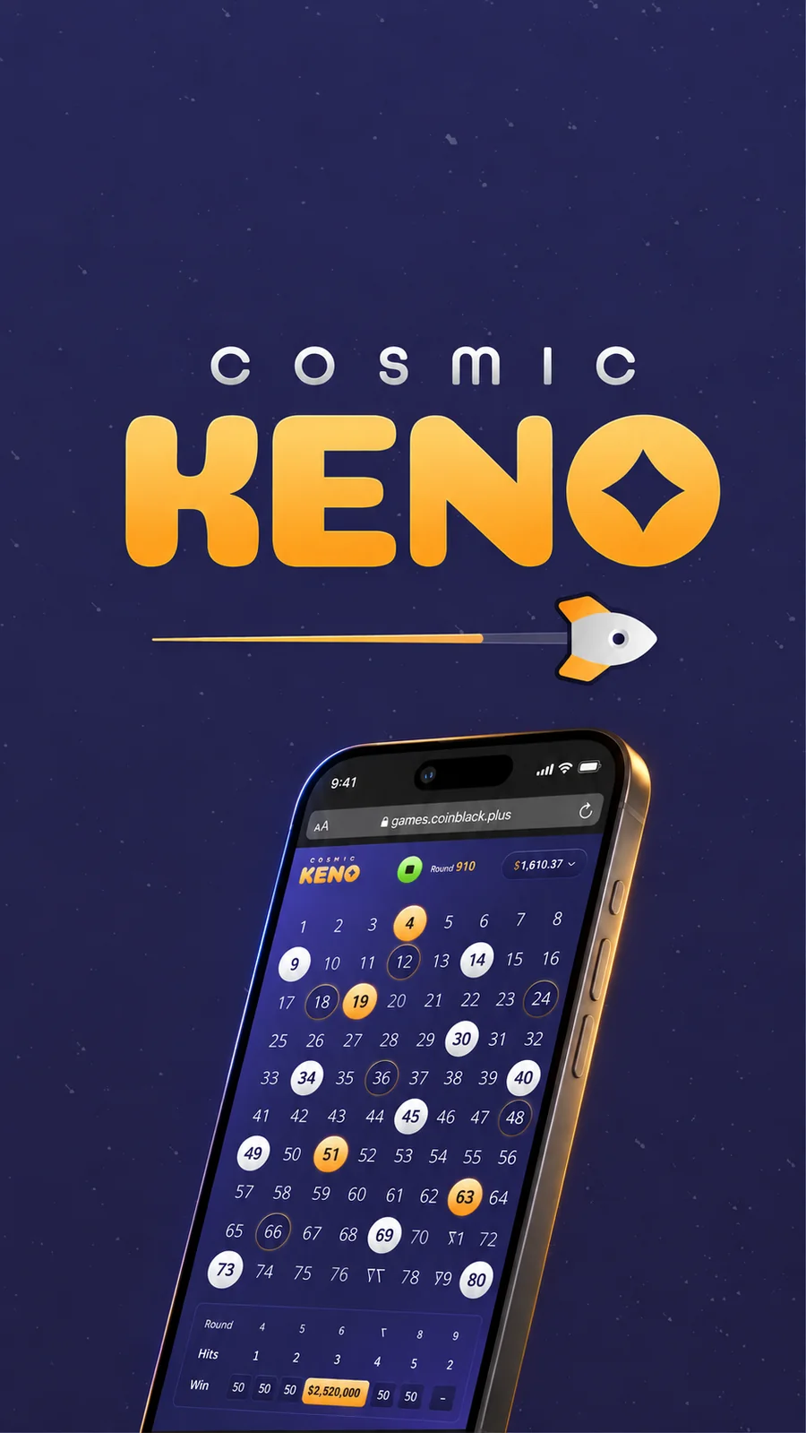
Designing a Better Keno Experience
At our CEO's request, I joined my UX/UI Lead to rebuild Keno for a single high-value VIP player who had been driving outsized profit on a game the rest of the platform barely touched.
Our goal was to deliver an improved, branded version of Keno that would align with upcoming platform integrations like Galaxy Casino and support future casino expansion. The result is a refreshed product direction built on better UX principles, modern visuals, and a scalable foundation for custom casino experiences.
Role
UX/UI Mid-Senior designer
Timeline
12 weeks · 2025
Team
UX Lead, Creative & Product Directors, a third-party dev team
Deliverables
UI Kit, responsive prototypes, and interaction & animation guides
Starting point
Keno had lived quietly inside the platform for years without much engagement, yet the handful of players who did use it generated disproportionate profit.
When our CEO asked for a premium version built around one specific VIP, I saw the real opportunity hiding underneath that request.
This wasn't just a favor for one player. It was a proven, profitable game that had never gotten a real product direction of its own, and building it right meant it could scale to the whole casino vertical later.
The legacy game had no analytics, no behavioral metrics and no usability history to design against.
Any redesign had to respect the flow this VIP already trusted instead of reinventing it just to feel new.
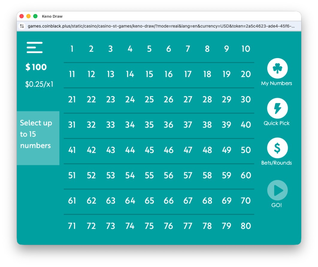
The legacy Keno board I inherited: no brand, no dedicated UI, just a generic layout reused across games.
What is Keno, exactly?
Keno is a simple, fast, and repeatable lottery/bingo style game where the player selects up to 15 numbers from a pool of 80. The game randomly draws 20 numbers, where the more numbers they match, the higher the payout will be.
PICK: Choose up to 15 numbers from 1–80.
DRAW: 20 numbers are randomly drawn.
MATCH & WIN: Payouts are based on how many selected numbers match the draw.
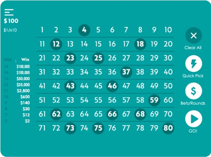
Players select their numbers and place their wager.
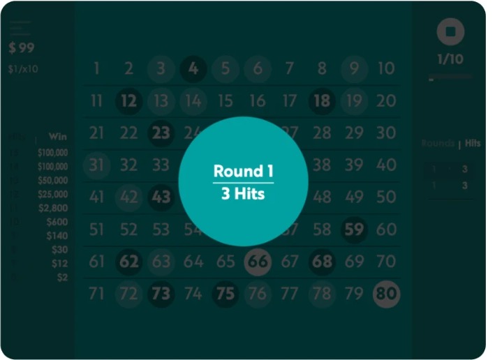
The game draws 20 numbers and calculates the payout based on matches.
Who I designed for
The VIP player
Needs to feel upgraded, not replaced
A habitual, high-value Keno player whose loyalty and spend can not be risked. Every change had to feel like an upgrade to a game he already trusted, never a swap for something unfamiliar.
The broader casino audience
Needs a reason to try it at all
Existing casino players who had never touched Keno before, but might if the experience felt modern, fast and rewarding instead of like the dated version buried in the old platform.
The problem
Research revealed a clear challenge: Keno needed to evolve without losing what already worked for its existing players.
We had to modernize the experience and improve its usability and reliability, while preserving the familiar behaviors and core flow players already understood.
Redesign without disruption
Keno had an established base of long-term players who were already familiar with its flow. The redesign needed to improve the experience without disrupting the behaviors and features they relied on.
Outdated experience
The interface felt dated, and some interactions made simple actions harder to understand than they needed to be.
What the project had to solve
Key constraints
Design approach
Familiar experience
Long-time VIP players already trusted and understood the existing game flow.
Preserve what worked
Kept the familiar grid, one-tap selections, and core betting logic while improving the experience around them.
Limited user data
The legacy product had no analytics or usability research to build from.
Learn through comparison
Used competitive benchmarking and hands-on product testing to identify patterns, gaps, and opportunities.
External development
Implementation depended on a third-party development team rather than an in-house team.
Design for handoff
Documented interactions, states, and design decisions clearly to reduce ambiguity during implementation.
Other priorities that shaped the design
A few extra requirements from stakeholders rounded out the brief.
Scalable
Built to extend cleanly to future casino verticals, including the upcoming Galaxy Casino integration.
Premium feel
A distinct visual brand, not just another reskin of the same old template.
Mobile-first
Designed for a VIP who is likely to be playing from a phone rather than from a desktop.
What are the business goals?
Business goals
The main objective was to increase revenue by reimagining a game that, while niche, has proven highly profitable.
By tailoring the experience for a high value VIP user, the business saw an opportunity to create a premium version that could appeal to their social circle, potentially attracting other high spending users and driving long term growth within the casino segment.
The design tension
Design a premium, scalable Keno experience for one high-value VIP player, without any behavioral data to guide me, and without breaking the habits that already kept them playing.
The process at a glance
Here's the twelve weeks compressed into six steps, from that first strategy meeting to the proposals that shaped the final design.
Kickoff meeting
A strategy session with our Creative and Product Director gave us full context on the VIP request and what the business needed.
The brief
One VIP, one premium experience, and a brief we saw as a chance to build something scalable from day one.
IA audit
We audited the existing structure, cut the redundancies, and rebuilt it around clarity and modern UI standards.
Gameflow mapping
Every screen, every step. Mapping the full game flow surfaced the pain points worth solving.
Hands-on testing
Playing the actual game ourselves exposed friction and missing feedback that a spec sheet alone would never catch.
Improvement proposals
With research and flows in hand, we proposed UX and UI upgrades built to feel premium and scale beyond just one player.
The solution
The hypothesis was simple: if the visual brand felt distinct, the component system was real, and every interaction was carefully documented, Cosmic Keno could feel premium for one player today and still scale cleanly to every future casino vertical.
Rebuild Keno's visual language into a distinct, premium brand without touching the mechanics the VIP already trusted.
Design a mobile-first UI Kit and component system flexible enough for future casino verticals.
Treat every micro-interaction, from number picks to draws to wins, as part of the product instead of something developers improvise at build time.
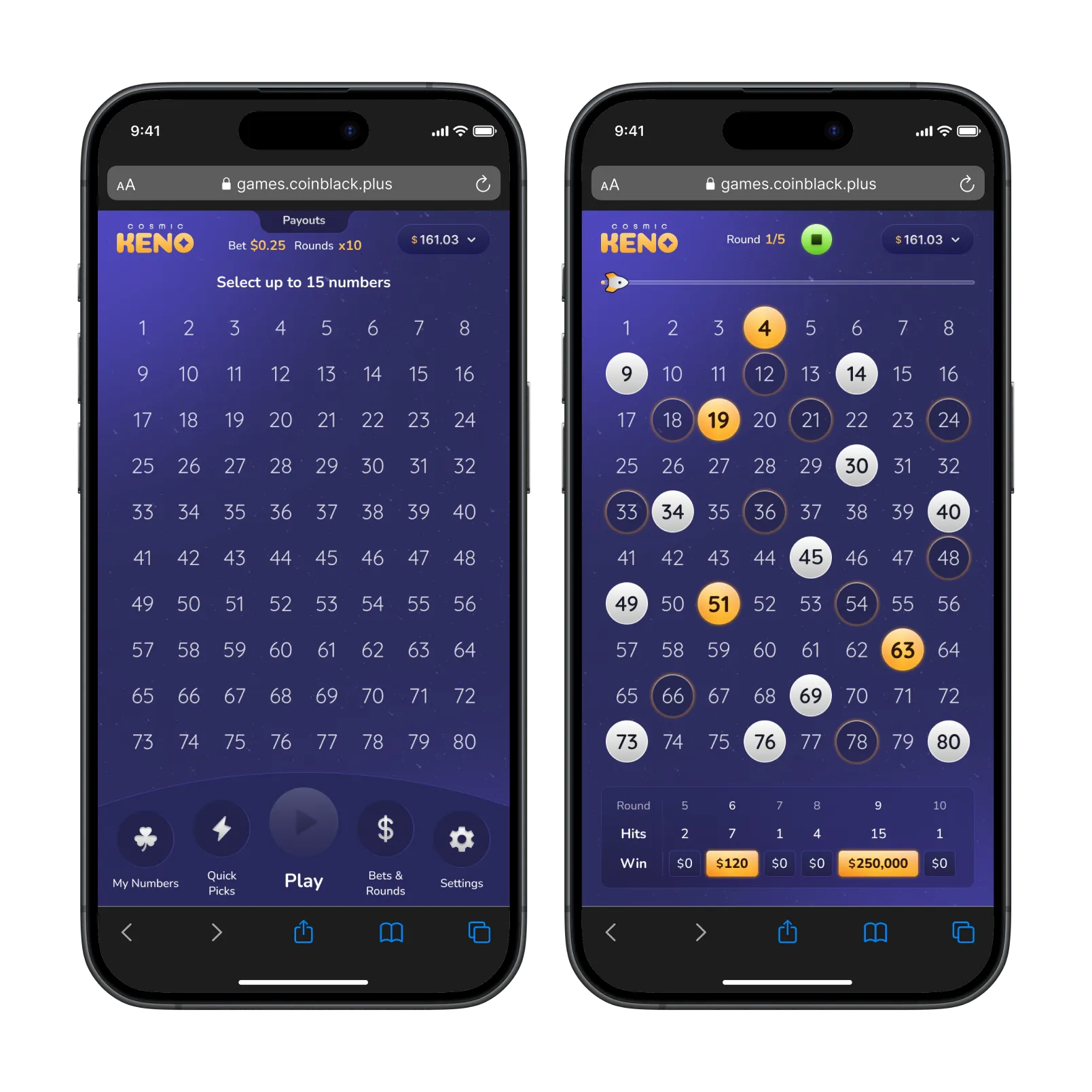
Overview
Visual identity
- A new color system: primary, secondary, accent, semantic, neutral, gradient and texture.
- A typographic scale built for both mobile and desktop.
Component system
- Buttons, the Keno board, progress bars and more, all reusable.
- Iconography, spacing, shadows and blur styles kept consistent everywhere.
Mobile-first design
- Every screen designed for a phone first, then scaled up to desktop.
- The same components powering both, no separate mobile-only patterns.
Micro-interactions
- Hover states, tap transitions and win reveals designed frame by frame.
- A dedicated animation guide once early builds fell short of the intended polish.
Personalization
- My Numbers, so a player can save a favorite set instead of re-picking it every round.
- Quick Picks, for filling a board in a single tap.
Handoff documentation
- A documented UI Kit and responsive wireframes for mobile and desktop.
- An interactive prototype plus a full video walkthrough for the dev team.
Process and key decisions
Two decisions mattered more than the rest once real screens and real limitations entered the picture. Here they are.
Keeping the core loop exactly familiar
Problem
With no usability data and a VIP whose habits I couldn't afford to disrupt, any structural change to the core loop was a real risk, not just a stylistic choice.
What changed
I kept the fundamentals the player already knew, the familiar grid, one-tap number picks, the same betting logic, and rebuilt everything around them: a new visual system, live hit tracking during the draw, and clearer real-time feedback on rounds and payouts.
Why it mattered
The game read as an upgrade, not a replacement. The VIP recognized it instantly, and leadership got a premium product without gambling on an unproven new flow.
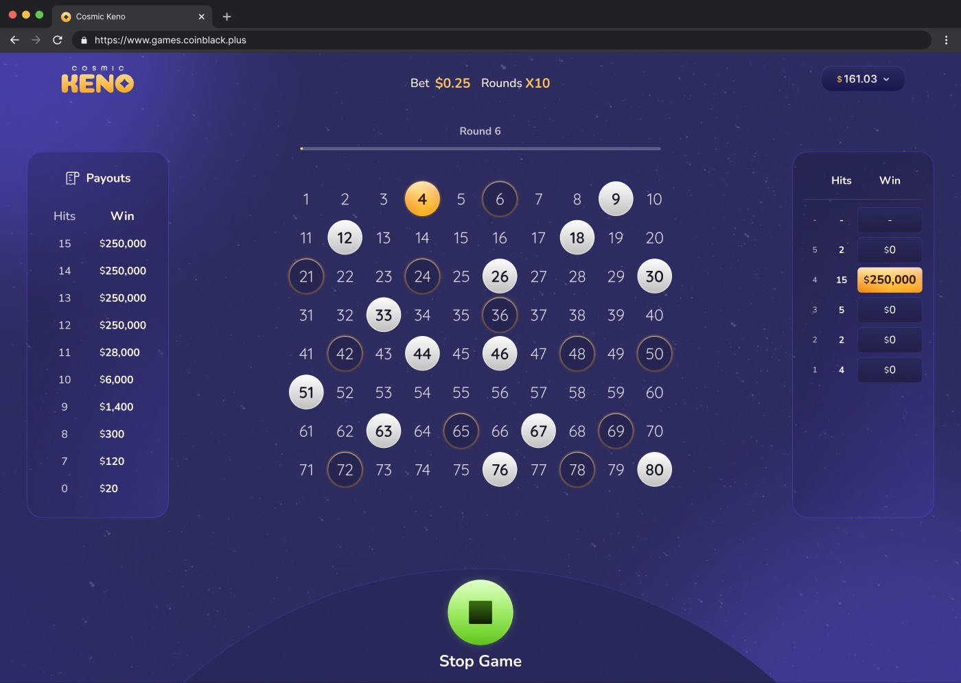
Documenting motion the dev team could actually build from
Problem
The dev team's first pass at the micro-interactions, hover states, tap transitions, win reveals, didn't reflect the polish we had designed. A written description alone wasn't giving them enough to build from.
What changed
At the Product Director's request, I put together a dedicated interaction and animation document covering hover states, tap transitions, timings and feedback cues, paired with a full video walkthrough so developers could see the intended feel instead of just reading a spec.
Why it mattered
That extra deliverable became the reference point that finally aligned design intent with what actually shipped, and it reinforced how much of Keno's feel lives in motion, not just layout.
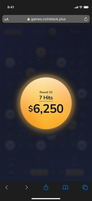
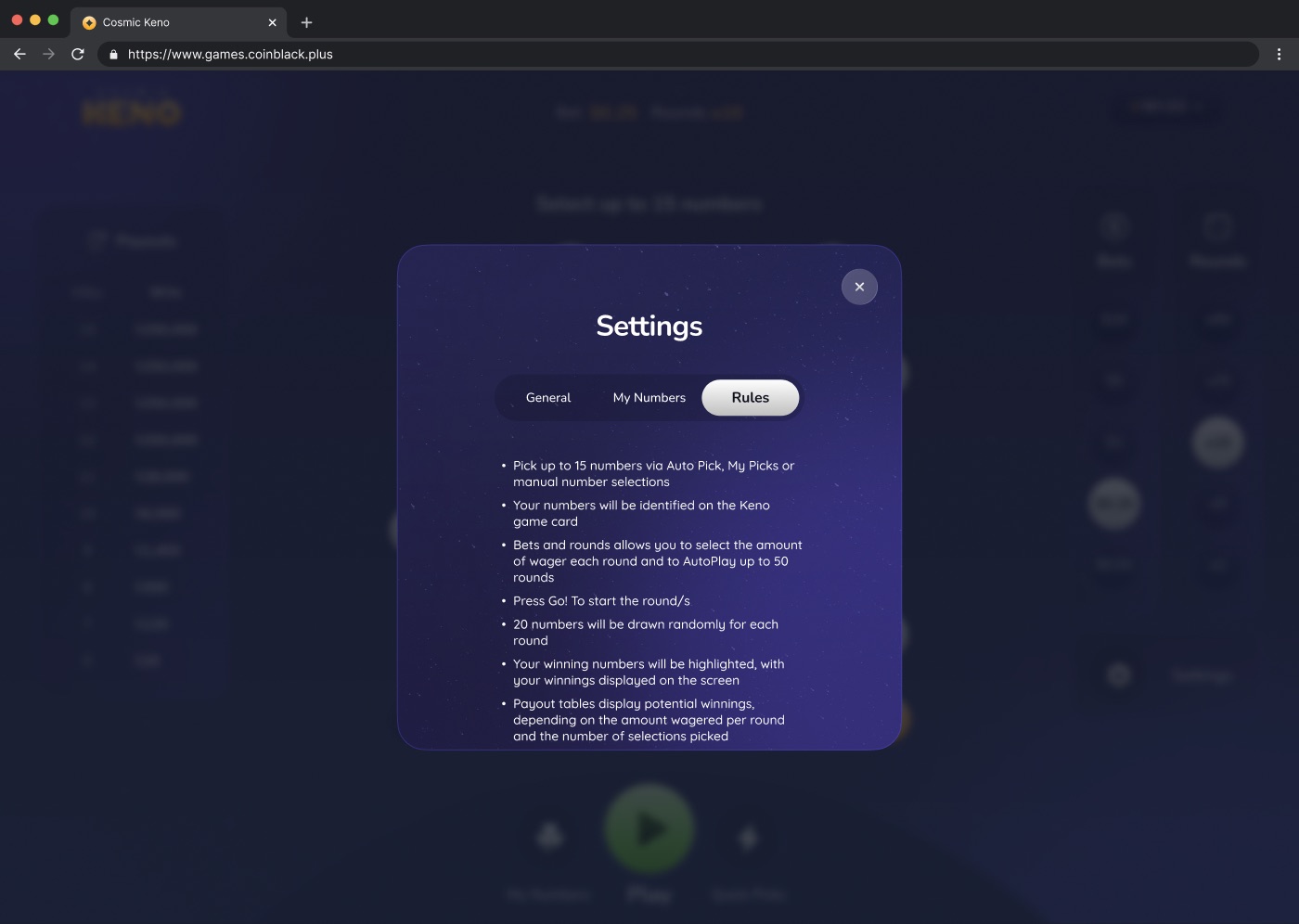
The in-game rules, written in plain language and mirrored in the dev-facing interaction guide.
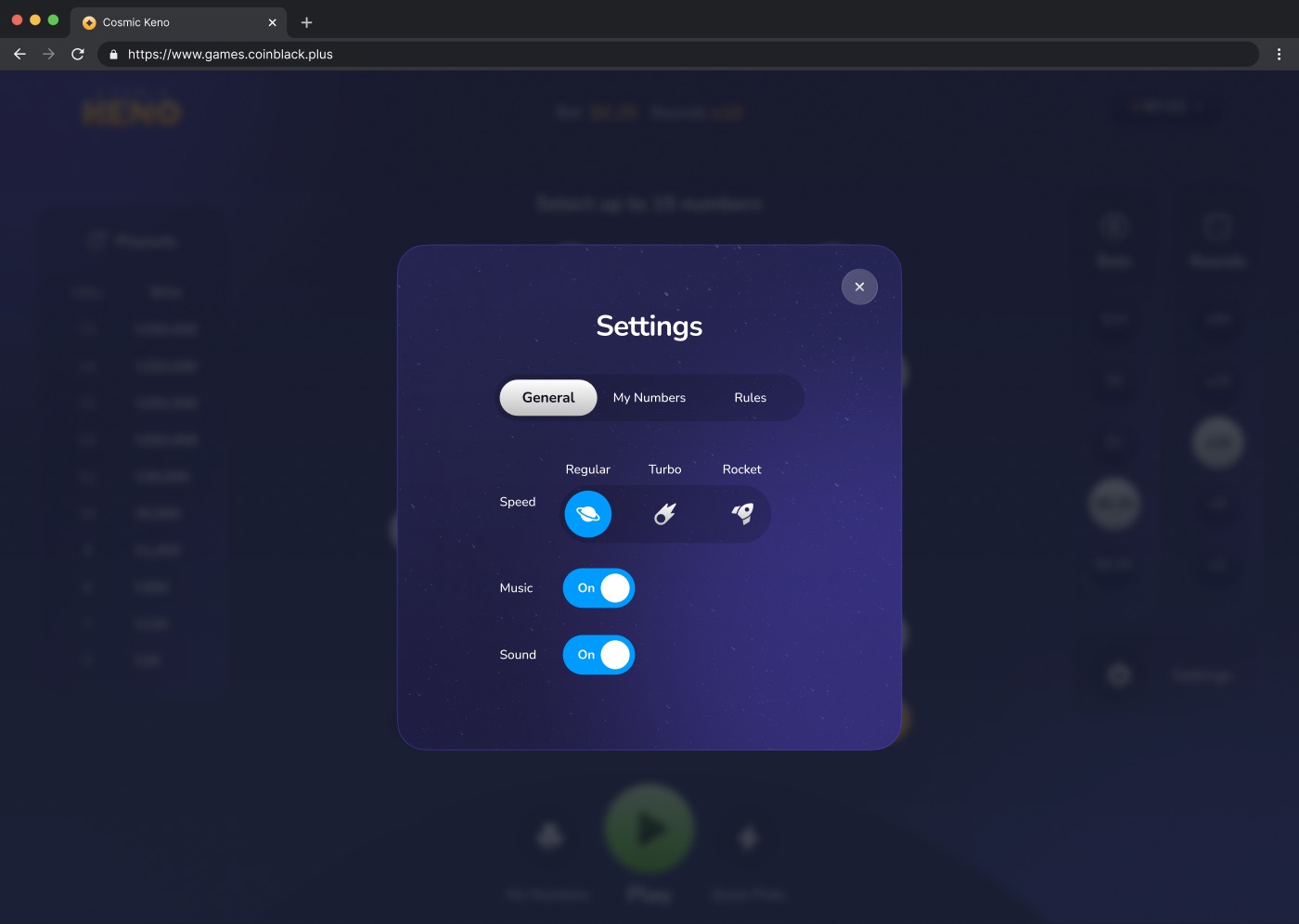
Settings for draw speed, music and sound, built from the same component set as the rest of the game.
My Numbers and Quick Picks, in the product
Two features shipped specifically for a player who comes back: saving a favorite set of numbers instead of re-picking it every round, and filling a board in a single tap when they'd rather not think about it.
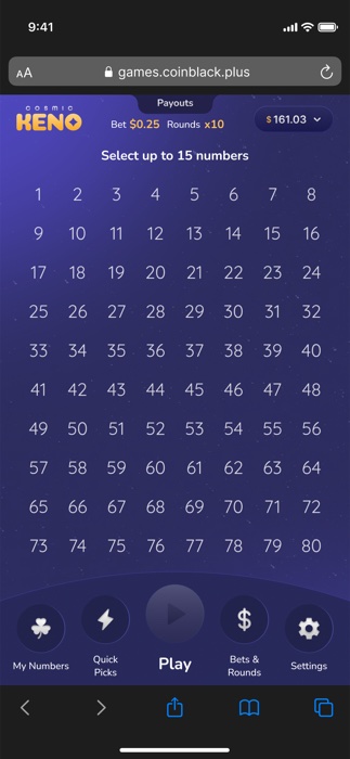
The full board, mobile-first.
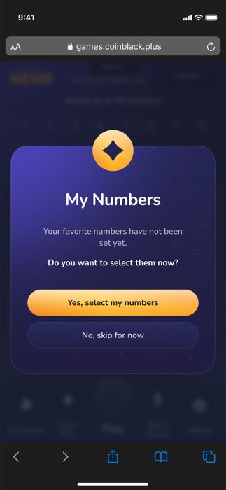
My Numbers, prompting a player to save a set.
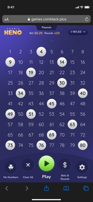
Quick Picks, one tap and the board is filled.
Relevant documentation
The dev-facing Figma file only held what implementation actually needed, plus these two recordings.
A full gameplay walkthrough of the interactive prototype, used to hand core flows and micro-interactions to the dev team.
Regular, Turbo and Rocket, the three draw-speed options designed and documented so developers could match the intended pacing.
Results
Cosmic Keno shipped to staging with the third-party dev team as a fully rebranded, component-driven game. I handed it off without hard production data to report yet, and that shaped as much of what I took from this project as the redesign itself.
What I learned: designing with flexibility matters most exactly when you have the least data and the tightest timeline. Staying close to product and creative stakeholders kept the project aligned even without a usability baseline to fall back on.
What I'd do differently: get in front of the actual end user earlier. I had one VIP player's qualitative feedback, but real conversations earlier in the process would have grounded more decisions in actual needs instead of informed assumptions.
What I'd try with more time: real user research and usability testing before handoff. Watching people actually play the prototype would have validated assumptions and surfaced pain points before they reached production.
Beyond this project
Two directions worth exploring next
Audio design. Sound wasn't part of the original scope, but it's an obvious lever for a game like Keno, where feedback and immersion matter. With a background in music production, I put together early sound iterations for number selection, countdowns and wins, a forward-looking proposal rather than a shipped feature.
Data-driven decisions. For our team, design isn't finished without validation. The next version of Keno needs the analytics the legacy game never had: engagement, behavior and performance tracking, so future decisions close the loop between intention and impact instead of relying on one player's word.
Questions about this project
No usability data. The legacy Keno game had no analytics or behavioral history, so beyond one VIP player's qualitative feedback, every early decision leaned on competitive benchmarking and hands-on play instead of validated user data.
Marvin, as UX Lead, owned stakeholder alignment, timeline, UX rationale and developer syncs. I owned the visual and interactive experience: the UI Kit, the mobile-first responsive design, every micro-interaction and the final handoff package, while we worked together on flow analysis and structural decisions.
The first implementation pass didn't match the polish we had designed for hover states, tap transitions and win reveals. A written spec wasn't enough on its own, so I built a dedicated interaction document plus a video walkthrough, something developers could watch instead of just read.
Talk to the end user earlier and more directly. One VIP player's feedback was valuable, but real conversations earlier in the process, plus usability testing before handoff, would have grounded more decisions in real behavior instead of informed assumptions.
Keep exploring
UX/UI Design
BetAnything
Migrated a legacy sportsbook into a fully rebranded platform, replacing an agency-led process with an internally owned design system.
UX Research
Post-Login Navigation Research
Two rounds of moderated usability testing that designed and validated BetAnything's post-login navigation.